|
Approach: One
to one
|
| Focus:
Year 8 Interpreting
a double line graph.
|
 |
480k |
Resources: Graph |
|
Questions / instructions:
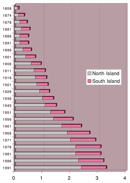
Show student the North Island
– South Island population graph.
This graph compares the population or number of people living in the North Island
with the South Island from the year 1858 to 1991.
|
|
|
%
responses |
|
y8
|
|

-
Press on image for Larger version
|
1. Look at
the graph, then explain to me what it tells you.
|
.
|
|
shows
how NZ population has changed
|
50
|
|
shows
North and South Islands separately (differences)
|
76
|
|
covers
years 1859–1991
|
28
|
|
Other
valid comments: 2 or more
1
|
9
32
|
|
2. Look at
the North Island population from 1936 to 1991. What does the graph tell you?
|
.
|
|
population
has increased
|
82
|
|
increased from x to y or increased 2–3 times or increased by 1.4 million
|
16
|
|
noted
lack of difference between 1976 and 1981
|
8
|
|
3. Look at
the South Island population from 1936 to 1991. What does the graph tell you?
|
.
|
|
population
has increased
|
69
|
|
increased from x to y or increased 2–3 times or increased by about x
|
8
|
|
slower
increase than North Island
|
28
|
|
total
less than North Island throughout period
|
28
|
|
grown
very little in last 20 years (cf. 1936–56)
|
5
|
|
4. Why do
you think the population keeps getting bigger in the North Island,yet it doesn't
change so much in the South Island?
|
.
|
|
Explanations
relating to jobs, weather, etc.:
2 or more good ideas
|
18
|
|
1
good idea
|
54
|
Commentary:
Most of the year 8 students
failed to comment in finer detail on the graphed data. |