|
||||||||||
|
|||||||||||||
|
|||||||||||||
| %
responses 2003 ('99) |
|||||||||||||
| y4
|
y8 |
||||||||||||
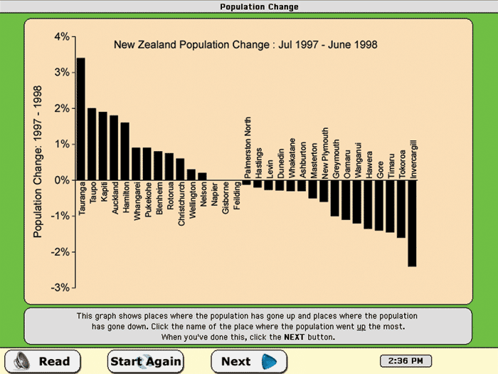
| Click the name of the place where the population went up the most. | Tauranga
|
88
(89) |
95
(97) |
||||||||||
| Click the name of the place where the population went down the most. | Invercargill |
43 (46) |
82
(75) |
||||||||||
| Click the names of the places where the population has not changed. | Napier,
Gisborne, Feilding |
16
(17) |
54
(49) |
||||||||||
| By how much did Taupo’s population go up? Type your answer into the yellow box. | 2%
|
63
(47) |
87
(80) |
||||||||||
Total
score: |
4 |
9
(12) |
48
(42) |
||||||||||
3
|
25
(17) |
29
(28) |
|||||||||||
2
|
37
(35) |
17
(20) |
|||||||||||
1
|
24
(31) |
5
(10) |
|||||||||||
0
|
5
(5) |
1
(0) |
|||||||||||
| Commentary: For year 4 and year 8 students there was no change between 1999 and 2003. |
|||||||||||||