|
:
Ice cream
|
|
|||||
|
Questions
/ instructions: |
|||||
| % responses | |||||
|
Part II Year
8 version |
Year
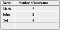
4 version Over one year Maria had 30 icecreams, John had 37, Tui had 24 and Bob had 60. Make a chart to show the number of icecreams they each had in one year. |
y4
|
y8
|
||
|
Part
I
|
80
|
98
|
|||
|
Part
II data
|
80
|
95
|
|||
|
headings
& labels
|
42
|
45
|
|||
| Commentary: The majority of students at both levels made a table, following the model from Part I. A majority of students at both levels neglected to provide complete headings and labels for their chart. |
|||||
[ top of the page | Graphs, Tables and Maps Report 1995 ]