|
||||||||||
|
||||||||||||
|
||||||||||||
|
|
%
responses 2003 ('99) |
|||||||||||
| y8
|
||||||||||||
| 1.
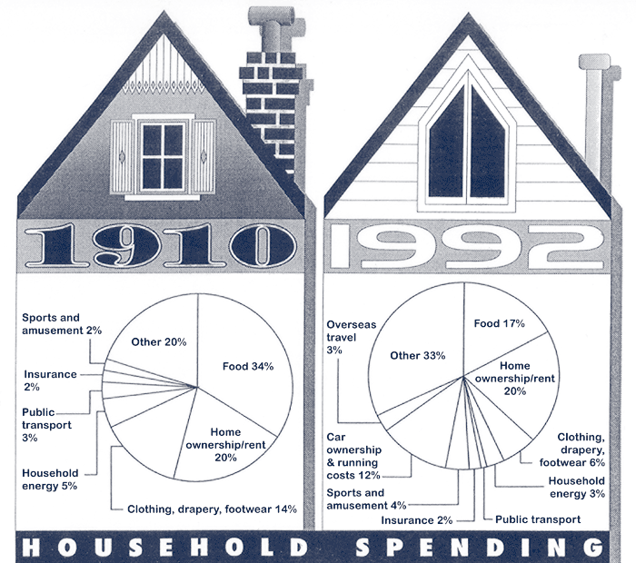
What things had the same percent of spending in 1910 and 1992? |
insurance
and home ownership |
54
(58) |
||||||||||
|
insurance
only |
4
(4) |
|||||||||||
|
home
ownership only |
34
(32) |
|||||||||||
| 2.
What did 1910 households spend a higher percentage of their money on than
1992 households? |
food
|
81
(82) |
||||||||||
|
clothing/drapery/footwear
|
44
(47) |
|||||||||||
|
household
energy |
43
(42) |
|||||||||||
|
public
transport |
37
(38) |
|||||||||||
| 3. What one area did 1910 households spend most on? |
food
|
90
(89) |
||||||||||
|
Total
score: |
7 |
24
(26) |
||||||||||
|
5–6 |
21 (21) |
|||||||||||
|
3–4 |
39 (39) |
|||||||||||
|
1–2
|
14
(12) |
|||||||||||
|
0
|
2
(2) |
|||||||||||
| Commentary: In 2003, year 8 students showed a range of responses when interpreting a pair of graphs (from 37 to 90 percent). There is no change in the level of achievement between 1999 and 2003. |
||||||||||||