|
||||||||||||
|
||||||||||||
%
responses |
||||||||||||
y8 |
||||||||||||
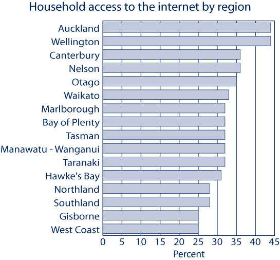
| Look at the graph showing access to the internet in New Zealanders’ homes. |
||||||||||||
| 1. Which regions had the highest household internet access? | Auckland and Wellington |
89 |
||||||||||
Auckland or Wellington |
10 |
|||||||||||
| 2. Which regions had the lowest household internet access? | Gisborne and West Coast |
93 |
||||||||||
Gisborne or West Coast |
7 |
|||||||||||
| 3. What percent of households in Otago had access to the internet? | 35 (%) |
90 |
||||||||||
| 4. What changes to the graph might you see, if this question is asked again in 5 years’ time? |
changes across all regions |
23 |
||||||||||
changes in general or specific regions |
48 |
|||||||||||
no changes |
29 |
|||||||||||
Total
score: |
7 |
20 |
||||||||||
6 |
42 |
|||||||||||
5 |
26 |
|||||||||||
4 |
7 |
|||||||||||
0–3 |
4 |
|||||||||||
| Subgroup Analysis [Click on charts to enlarge] : |
Year 8 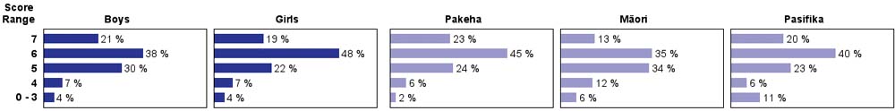 |
| Commentary: |
| Most year 8 students extracted accurate information from this graph. Understanding of likely trends in internet usage was more mixed. Boys, girls and all three ethnic groups permormed similarly. |