| Approach: Station |
Level:
Year 4
and year 8 |
|
| Focus:
Interpreting
a pie graph
|
| Resources:
Graph |
 |
128KB |
|
|
Questions/instructions:
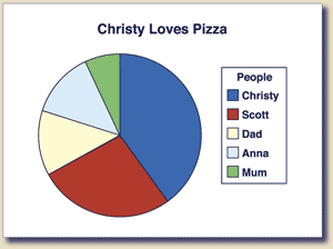
The pie graph shows how much everyone in Christy’s family
ate from one pizza. |

[click on graph to enlarge] |
|
| |
%
responses |
y4 |
y8 |
| 1.
Who ate the most? |
Christy
|
98 |
98 |
| 2.
Who ate the least? |
Mum
|
96 |
99 |
| 3.
Who ate equal amounts? |
Anna
and Dad |
82 |
95 |
4.
Did Scott eat more, less, or the same as Dad and Anna together?

|
c
|
35 |
53 |
| |
|
|
Total
score:
|
4
|
29
|
50 |
3
|
58 |
46 |
2
|
10 |
4 |
1
|
3 |
0 |
Commentary:
Both year 4
and year 8 students were very successful at interpreting a simple pie
graph when asked to identify straightforward information. Where a complex
interpretation was required (Q4), about 50 percent of year 8 and 35 percent
of year 4 students were successful.
|