|
|||||||||||||
|
|||||||||||||
%
responses 2007 ('03) |
|||||||||||||
y4 |
y8 |
||||||||||||
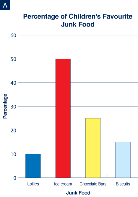
| 1. What percentage of children said biscuits were their favourite junk food? | |||||||||||||
15% (15) |
51 (59) |
86 (81) |
|||||||||||
14% or 16% (14 or 16) |
3 (3) |
2 (4) |
|||||||||||
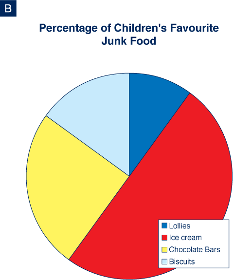
| 2. Which graph did you use to work that out, graph A or graph B? | |||||||||||||
A |
88 (92) |
93 (93) |
|||||||||||
B |
8 (7) |
6 (5) |
|||||||||||
| 3. Why did you use that graph? | |||||||||||||
Bar: |
explanation showed good understanding
of bar graph
(e.g. has numbers) |
50 (48) |
57 (59) |
||||||||||
preferred that type of graph/was easier/
seen that type before |
19 (21) |
14 (11) |
|||||||||||
both above |
13 (14) |
20 (20) |
|||||||||||
| 4. What junk food did half the children say was their favourite junk food? | |||||||||||||
ice cream |
52 (61) |
86 (85) |
|||||||||||
| 5. Which graph did you use to work that out, graph A or graph B? | |||||||||||||
B |
51 (58) |
71 (61) |
|||||||||||
A |
39 (31) |
18 (23) |
|||||||||||
| 6. Why did you use that graph? |
|||||||||||||
easy to see half (pie graph) |
46 (51) |
75 (70) |
|||||||||||
50% was half, easy to see (bar graph) |
17 (8) |
17 (21) |
|||||||||||
liked that type of graph/was easier/
had seen that type before |
23 (16) |
16 (17) |
|||||||||||
it was the first one student looked at and gave answer |
2 (0) |
4 (2) |
|||||||||||
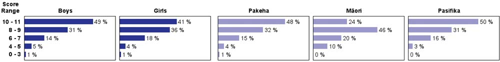
Total
score: |
10–11 |
22 (31) |
45 (36) |
||||||||||
8–9 |
29 (25) |
34 (38) |
|||||||||||
6–7 |
25 (19) |
16 (17) |
|||||||||||
4–5 |
16 (17) |
5 (8) |
|||||||||||
0–3 |
9 (8) |
1 (1) |
|||||||||||
| Subgroup Analysis [Click on charts to enlarge] : |
Year 4 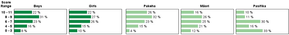 |
||
| Commentary: |
| Students at both years were fairly successful in determining which graphs provided the best information in a given setting. Moderate growth was seen from year 4 to year 8. There were few differences in performance by gender or ethnicity. Year 4 students showed a slight decline in performance from 2003, while year 8 students showed a slight increase. Pasifika students scored lowest at year 4 but highest at year 8. |